How do we design the perfect logo for your company?
Many of our clients ask us what is important when choosing a logotype. This article aims to serve as a guide to help those that are indecisive when it comes to choosing an appropriate brand for their product or business.
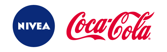
Simple can often be very effective. If we think about some of the biggest international brands, they usually have logos that contain a very few elements.

Memorable is an important characteristic that relates to the logotype being simple. Simple logos are easy to remember. Similar to how a short, simple name is memorable, a simple logotype will be easier for members of the public to recognise and remember.
Colours of a logo should be limited to make the best impression. Normally, the use of 3 colours is the optimum amount, although every case is different and there are some businesses that will require more colours in their brand.

In harmony with the business. When we say that a logo should be in harmony with the business we don’t necessarily mean that, for example, the logo for a vet clinic would have a queue, ears and barks. We are actually referring to the choice of text and visual aspects in line with the business, the service they offer and, above all, the target audience. Understandably, a logo for a children’s shop would not be appropriate for a solicitor´s office.

Timeless. Like everything in life, in the world of logotypes and brands they are trends that stick around and trends that disappear in the blink of an eye. When designing and choosing a new brand image, it is important to be aware of these tendencies and to get the advice of a design professional about the best way to ensure the durability of your brand. It is essential to stand out from the crowd and when designing or redesigning a logo we must have in mind how it will function for a long period of time into the future.

Versatile. A logotype should be created so it can be used in any format that we require. We can’t forget that the logo represents a brand and will be needed to work correctly on any type of surface, having in mind that if it is put onto a either a dark or light colour, it can be seen on the screen with no problem.

What is an ineffective logo? After all these ideas we can define an ineffective logo as one that doesn’t meet all the points made above. A logo that is overloaded, complicated, with lots of colours, gradients and shadows, that is completely disconnected from the business that it represents, etc., is an ineffective logo. Additionally, there is a common misconception that copying a leader of a sector will guarantee success. In fact, the best way is to study the competition in terms of its visual identity and to differentiate ourselves with our distinguishing feature. This will set us on the path of success and make us stand out from the rest.