LOGO DESIGN FOR ELECTROSTIMULATION
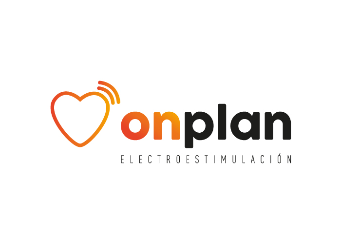
This client came up with the idea and business model but came to factoryfy to help in creating the name and its corporate image. Our design team created a number of different names that matched the needs of our client. The chosen name, onplan, is split into two parts to create the brand. The first part, on, represents physical activity and also the machines that are used in electrostimulation. The second part, plan, is the plan to be 100% in shape in terms of sport, health, nutrition and every area that onplan encompasses.
The second step was to create the image for the brand. We chose a heart, which is the best way to represent everything that our client wanted to express. It epitomises health and physical well-being. A couple of small waves have been incorporated, which could represent electromagnetic waves of the onplan equipment.
Finally, to give the name even more life, powerful colours have been used to make the image and name strong. By placing the main emphasis on ‘on’, it can stand alone as a prefix on publicity posters or any additional onplan services.
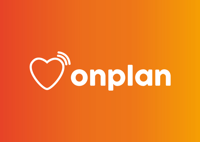
This is a logo that can also be printed on t-shirts, towels, etc., showing that it is equally powerful in positive and negative.
CATEGORIES
Logotype | Sport