Which logo do I choose?
A company’s image is fundamental. It marks its identity and has the ability to communicate its core values to the public. In addition, it´s how the company is recognised and it could be said that the logo is the face of the company. So, it is very important to have a clear answer to the following question: What face do I want my company to have? At Factoryfy we know that this process is as complex as it is important. With this in mind, we wanted to make the logo selection process a bit easier by creating a guide to the different types of logos. So hopefully you won’t get lost amongst all the design terminology and you will be able understand the difference between each type of logo. If you still have any doubts, don’t worry, we are here to answer your questions.
1. TEXT LOGO. This logo just includes the text component.
In this category, you also have the option of integrating an image into the existing text.

2. Initials Logo. In this option the logo is created from the initials of the company (or the name you have chosen), plus a descriptive text of these initials.
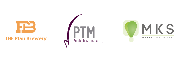
3. Stamp Logo. This logo is created to look like a stamp or an emblem.

4. Text and Image Logo. This is the most popular category of logo and within it are various different styles to choose from.
* Classic Construction. The most commonly used layout is usually with the image to the left or on top of the text. Here are examples of both layouts.


* Geometric Style. The text is accompanied by geometric shapes or a polygonal image.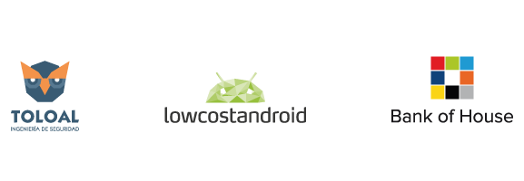
* Informative Style. With this option the text is accompanied by 2 or more images that represent the principal values or skills of the company.
* Abstract. The image that accompanies the text gives a clue to the sector and work of the company.

* Realist. The image that accompanies the text is specific and clearly shows the type of work done by the company.
* Illustration. The text is accompanied by a more complete and detailed image. It is more a drawing rather than a symbol.


