Justify the unjustifiable
The justification of text is something that has always been spoken about in the world of design and of course it has its pros and cons. Its use has always been surrounded by controversy as ultimately it is a question of aesthetic preference, just like colours. We would like to know your opinions your opinions on this topic, but first it is important to understand what we are talking about. Here we will explain what a justified text consists of, so you are able to formulate your opinion.
WHAT IS A JUSTIFIED TEXT?
WHAT IS A JUSTIFIED TEXT?
Justifying a text consists of lining up paragraphs so that everything fits inside a perfectly symmetrical square and all the lines are of the same length. Justified text is used in books, magazines, newspapers and in other types of paper formats. Usually we are used to seeing it in traditional written mediums. To justify a text well, it is necessary to carefully choose and keep in mind certain aspects: the size and type of the letters, the separation of syllables, length of the text, etc.

WHY SHOULD A TEXT BE JUSTIFIED?
WHY SHOULD A TEXT BE JUSTIFIED?
The main advantages of justifying a text mostly reside in the visual order of a page. For example, with justified texts we are able to distinguish one text from another that are placed next to each other on a page. By doing this we are able to eliminate any confusion whilst reading. The truth is that aesthetic has the most gravity when making the decision. Some individuals might think that a justified text is more attractive or creates a sober, elegant style.
THE RISKS OF A JUSTIFIED TEXT
THE RISKS OF A JUSTIFIED TEXT
It is generally more acceptable to use a justified text in printed mediums, as it is usually preferred and is a question of aesthetic.
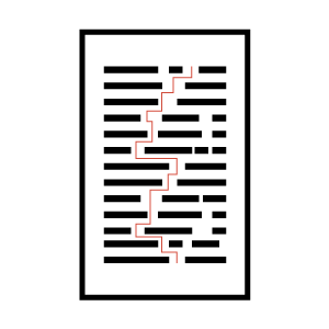
The first problem that can arise in the justification of a text is the appearance of lots of white spaces. These are the spaces that appear in between words when the lines are elongated in order to be of the same length. Modern word processors and desktop publishing software automatically adjust space between words in order to fill all lines except the last. These unwanted white spaces are called “rivers” due to the way they appear to run in lines down the paragraphs. For this reason a justified text only really works when it is compact, without the presence of the rivers or white roads.
Although the main reason for justification is improving the readability of a text, it can actually result in being counterproductive. When reading an unjustified text it is easier to identify the line that you have just read as they are all of different length. When a text is justified, it runs the risk of the reader losing their place if they look away for a moment.
JUSTIFIED TEXTS ON THE INTERNET
JUSTIFIED TEXTS ON THE INTERNET
When things jump from paper to screen, they change quite noticeably. Here we explain why this happens.
There are many reasons as to why we wouldn’t advise the use of justification in the majority of cases of text that appears in digital format (web pages, blogs, etc). The main reason is that good text justification requires the careful choice of elements by the professional tools used in the creation of publications: font size and type, page width, length of the text block, syllable separation, language, etc.
Unfortunately, on a web page none of these things can be controlled. This is why it is rare to see justified text on a screen. Browsers are not prepared to generate justified texts and are unable to organise the words correctly, which means that the unwanted white rivers appear. It is generally unadvisable to justify texts on web pages. Due to this fact, newspapers such a El Pais or The New York Times do not justify their websites.

CONCLUSION
CONCLUSION
Generally it is advisable to avoid justification, especially in digital mediums because of issues of accessibility and legibility. There are few occasions where it is used correctly.