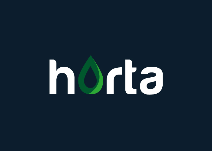
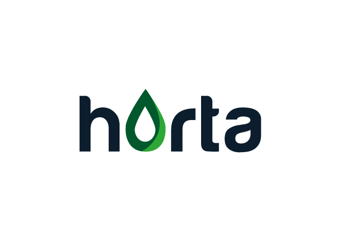
LOGO DESIGN FOR A PETROL STATION
Horta put the redesign of their brand image into the hands of factoryfy. With the new logo for its station, the company wanted to give the sensation of familiarity and connection to the neighbourhood.
The factory got down to work and created a personalised, unique product that is 100% exclusive to Horta.
The logo successfully portrays the values specified by our client and also implies that Horta cares about the environment.
Taking advantage of the O in the text and changing it into a droplet, it is instantly associated with drops of petrol and the use of the colour green provides an association with the company being green and more ecological.
This is a clean, solid and powerful brand, with lots of application possibilities, for example, on uniforms, receipts, etc…
A brand that is perfect for a sector that also needed redesigning.
CATEGORIES
Logotype | Services |

