LOGO DESIGN FOR APARTMENT RENTAL IN MALAGA
We designed this logo for a company that is dedicated to apartment rentals in Malaga, although, their business model does not end at rentals. They also offer the possibility to get to know Malaga as if you were a Malagueño. Local guides help you make the most of your stay in the Costa Del Sol by introducing you to the streets, culture and food of the city.
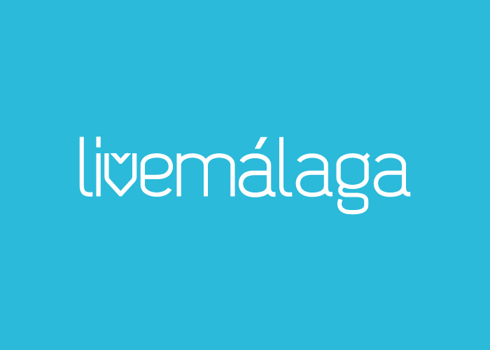
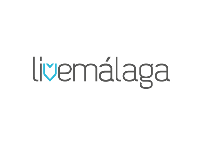
Following the instructions given in the brief, our design team managed to create a logo that 100% matched what was asked for. A logo that not only met the visual requirements, such as legibility or composition, but also that perfectly represents the values that Livemalaga wish to convey.
The text composition is created from a font that is modern, easily recognisable by the public and gives the logo lots of personality. The other part of the logo is the isotype that perfectly represents the business model for what it is and for what it represents.
The isotype was created from the V in the existing text, which represents 3 very clear and identifiable elements of the company. On one hand it represents a house, which is essential for a company dealing with property. On the other hand it evokes the form of a heart, which is a great way to put across values of closeness to the client, reliability and security. Last but not least, it’s form and position represent a global localiser, which is used vastly in this sector.
As for the colour, Malaga is associated with the colour blue as it is close to the sea and the pastel colour contributes to the warmth, reliability and security of the business model.
CATEGORIES
Logotype | Travel |

