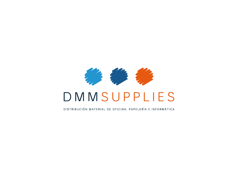
LOGO FOR AN OFFICE SUPPLIES DISTRIBUTION COMPANY
Factoryfy designed the logo for this large IT office supplies distribution company. DMM Supplies operates on a national level and in many cases is the only authorised distributer of big brands.
This logo doesn’t leave anything to chance by constructing a modern brand at the cutting edge of design, which provides the necessary elegance and strength without losing its modern side and identification with the sector.
In order to create this logo, our design team opted to use a sans-serif typeface, but with some personal touches. Thanks to the use of two colours in the name, there is no need to create space between DMM and SUPPLIES, creating a much more solid, balanced structure.
To finish off the logo, the isotype for DMM SUPPLIES has both an aesthetic and conceptual significance. The three points represent the areas of the business, e.g., the distribution process, as well as aesthetically symbolising the strokes of a marker, which refers to the sector they work in.
CATEGORIES
Logotype | Services |