LOGO DESIGN FOR A SEX SHOP
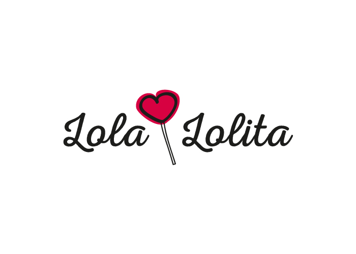
Factoryfy got to work on developing a fun, sensual logo, without falling into anything predictable or vulgar. The isotype is placed between the two words of the company’s name and can be used both with or without the text. The client also liked the idea of a handmade style, so we digitally illustrated the heart lollipop and gave it a naive touch with the red splodge that is the logo’s central focus.
CATEGORIES
Logotype | Services |

