LOGO DESIGN FOR AN ONLINE CONSULTANCY
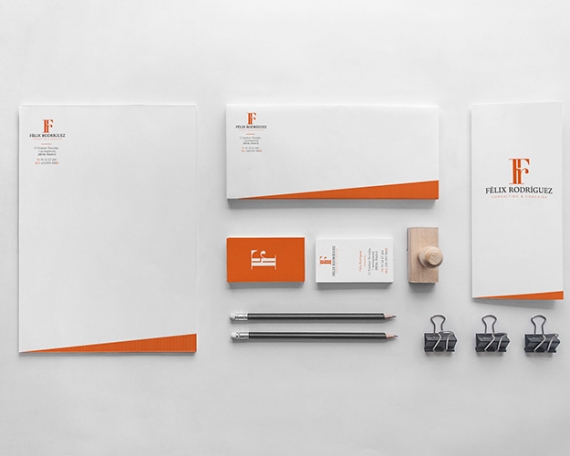
We designed the logo for this new and modern online consulting company.
To achieve a coherent brand image, the Factoryfy team moved away from the typical consulting logotypes and looked for something a lot more modern and dynamic through its use of colours, layout and perspectives.
Through combining the isotype and a modern text with curved lines (in contrast to the straight lines in the isotype), we managed to create a balanced logo that is both modern and coherent with the business.
Without a doubt, the best way to build a great company is to start with a great logo.
CATEGORIES
Consultancy | Logotype |


