LOGO DESIGN FOR A LANGUAGE ACADEMY IN MALAGA
Languages open doors and ODOOR knows this all too well. The client came up with this name from the idea of a door of opportunities, which is exactly what this academy is. They trusted us with the redesign of their corporate image and their website in order to open even more doors of opportunity.
On the basis of not losing the academy’s essence, our team got down to work and created an intelligent, attractive, and functional design that, most importantly, represents its concept.
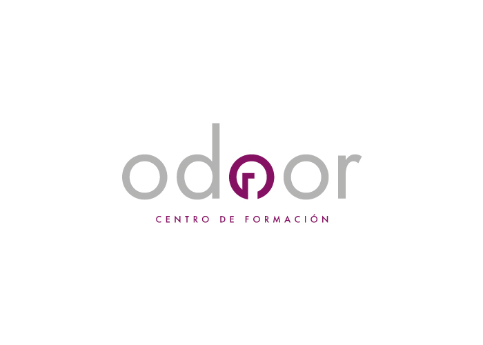
Thanks to the use of sans-serif and the big circles in the lettering, our team was able to modify the O into looking like a door (a door of opportunity). As this O is directly in the centre of the word, a nicely balanced, modern and legible design has been achieved.
CATEGORIES
Logotype | Services |

