The importance of a legible logo
BECAUSE SIZE IS IMPORTANT
Legibility at all sizes is one of the most common problems that face designers when creating a logotype. During the creative process of a brand, the designer and client wish to create an isotype (image) that perfectly complements the brand. It needs to be a visual reference that can be well recognised in a big market and therefore generate higher profits for the business. Although, an image within a brand is not always necessary.


HOW TO CHOOSE A GOOD LOGO
- SIZE MATTERS
Legibility at all sizes is one of the most common problems that face designers when creating a logotype. During the creative process of a brand, the designer and client wish to create an isotype (image) that perfectly complements the brand. It needs to be a visual reference that can be well recognised in a big market and therefore generate higher profits for the business. Although, an image within a brand is not always necessary.
- LESS IS MORE
Size is important. In the case of logos, the smaller the logo, the better. We need to take into account that in this day and age logos are used in various different media platforms and the way is now being paved for much more use of digital platforms. These could vary between a large cinema screen and a much smaller mobile phone application. Consequently, we must realise that it is essential for a brand to look good when it is both 2 metres and 20 millimetres in size.


- LEGIBLE FONT
Many years ago, there were only a limited amount of fonts available and they were all difficult to work with. Thanks to the arrival of the digital era, the production of text is now much easier and the amount of fonts available has grown. Now there are so many options that we can sometimes get lost and end up choosing the wrong one. When selecting the font type for our logo, we have to bear some factors in mind: legibility, spacing between letters, the rise and fall and that it is a complete text. Out of all these things, the most important is its legibility. If a logo is extremely legible it can have many different uses. Texts that are excessively bold or light run into problems when they are reduced to a considerably small size. They often appear just as a smudge or even completely disappear.


- LOGOS FOR LARGE COMPANIES
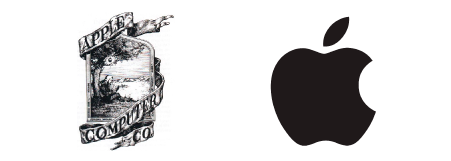
Here we can play a bit of a game. Think about some of the biggest brands and compare them to what they looked liked many years ago compared to now. We have mostly seen designs go through a transformation from being realistic to more minimalist and plain. Logos for large companies such as Apple have gone through a huge renovation.
CHANGES IN LARGE COMPANIES
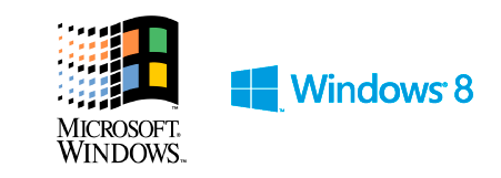
Other leading brands such as Windows and IBM have also undergone redesign over the course of their existence in order to be up to date with today’s market.


CONCLUSION
Ultimately, we must take into account the smallest size of a logo and whether it will be legible in this state. The smaller size that is available, the larger the chance of successful reproduction and will therefore have better visibility over other brands.


