LOGO DESIGN FOR A MOBILE APPLICATION AIMED AT THE CHINESE MARKET
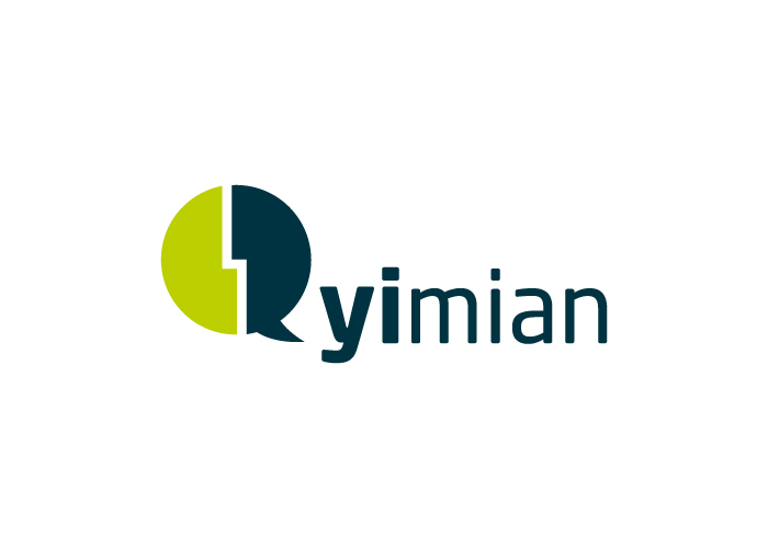
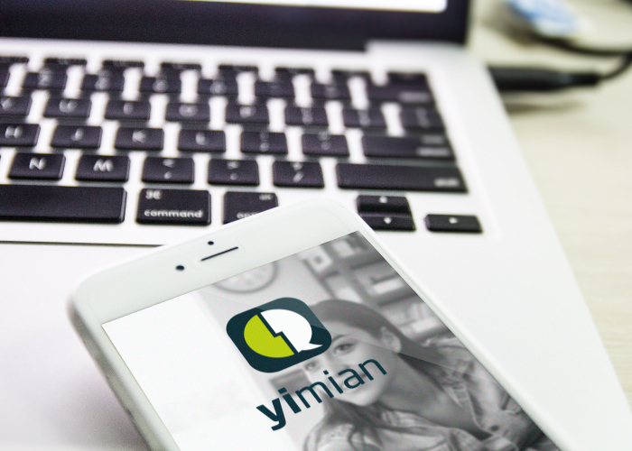
Yi Mian is a mobile application that aims to help companies search for potential employees and the general public to search for jobs. This application will be first launched in China, although its worldwide launch is definitely a possibility.
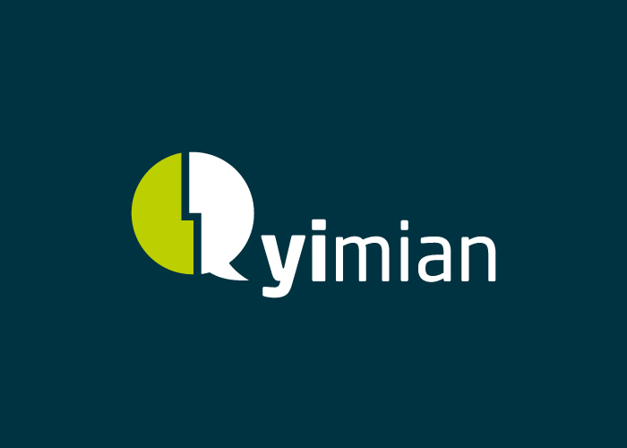
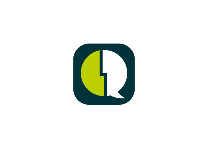
Our client had it clear in mind that name of the company and the logo had to express the same idea. Yi Mian means “First Face” or “Interview”, so our team got to work on developing a logo that revolved around these two ideas. The final result is a logo that is formed of two faces looking at eachother, just like they would be in an interview.
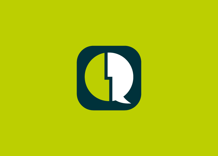
Additionally, it needed to be a simple logo is the sense of its form, as its primary usage would be as an APP icon and it also needed to really stand out from all the other icons on our device. With all this in mind we came up with the final concept, an icon that represents a two people talking and communicates the function of the app.
CATEGORIES
Logotype | Technology |

